
Quick Answer: When should you use a long or short landing page?
Use a short landing page when visitors understand the offer and can take the next step with little risk. Add detail when people need evidence, terms or a comparison to decide.
| Decision factor | Short page fits | More detail helps |
|---|---|---|
| Commitment | A simple download or reversible step | A purchase, integration or ongoing obligation |
| Familiarity | Visitors know the product and terms | Visitors need to determine whether it fits |
| Evidence | A preview answers the main question | Proof needs context, scope or a method |
Keep the offer clear at the top. Give each additional section one unresolved buyer question to answer.
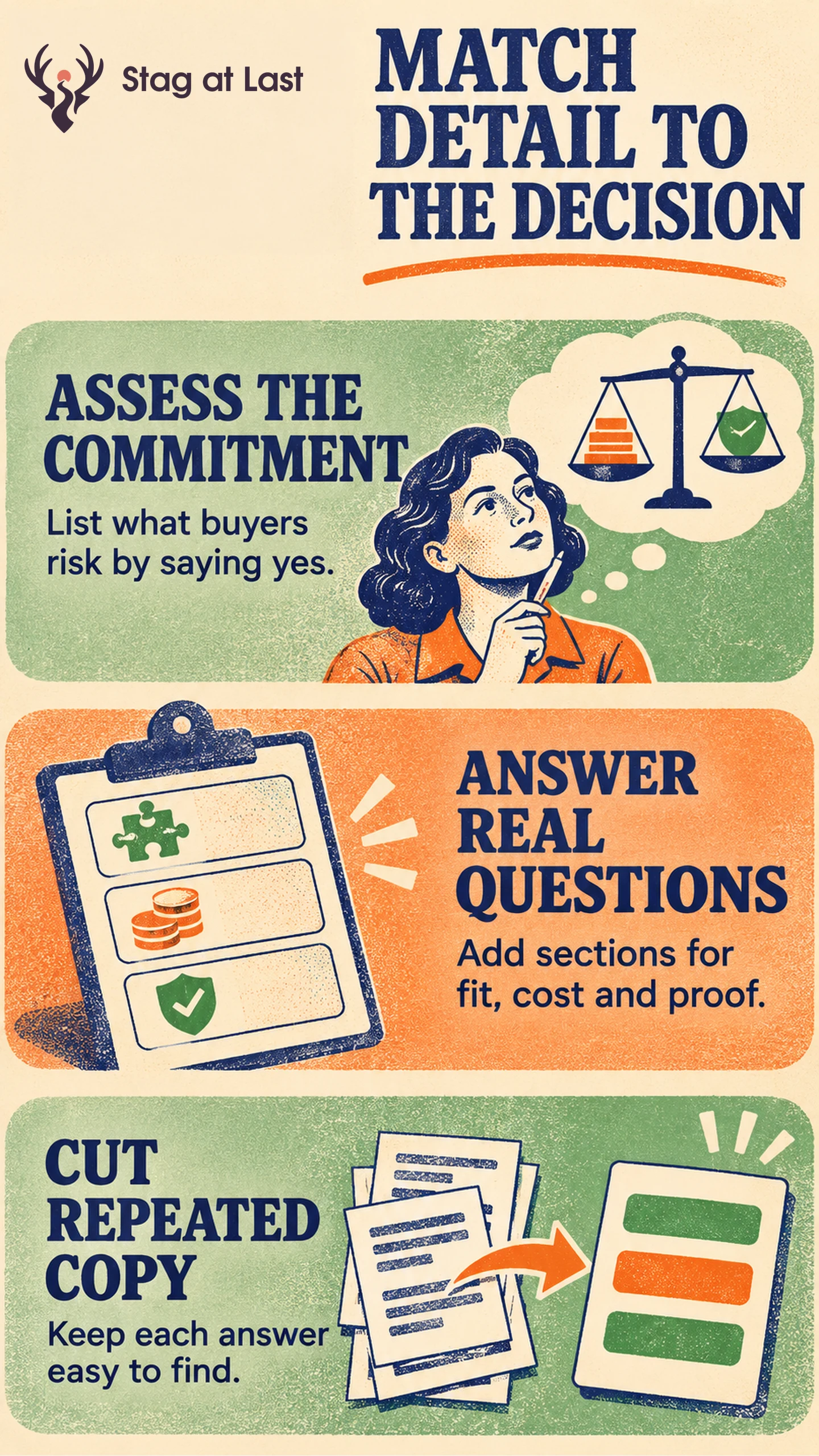
A landing page for a spreadsheet and a landing page asking a team to replace its scheduling system can serve the same audience. Their visitors still need different amounts of information. Choose how much to explain by asking what the visitor needs to understand before they can take the next step with confidence.
Start With the Cost of a Wrong Decision
List what the next action requires in money, time, information and staff effort. A free download may need only an overview and a file preview, but handing over a phone number can feel like agreeing to a sales call. Put the actual commitment next to the button. For a quote or demo, say what the team will do with the request and what the visitor should prepare.
In a hypothetical example, a warehouse manager following a partner email can judge an inventory spreadsheet from the format, a preview and the number of fields required to receive it. The same manager viewing stock-management software through a search ad may need to see warehouse limits, how existing stock is imported and who supports setup. Include what the buyer needs for the action you ask them to take now. A demo request and a purchase can warrant different detail even for the same tool.
Build the Shortest Page That Answers the Questions
Put the offer, audience and immediate action in the hero section. A Nielsen Norman Group desktop study tracked eye fixations from 120 participants across several page types and observed that attention was concentrated toward the top. [1] Apply that observation as a reason to make the opening informative. Use task checks to see whether visitors to your campaign can find detail further down.
For every extra section, name the question and the fact that answers it. A clear price and scope comparison can reveal whether the buyer fits the offer. A short customer example with relevant context can show what setup required. Link to a long technical specification when a minority of buyers needs it. State decisive costs or eligibility limits directly on the page.
Remove repeated claims that leave the same question unresolved. Use accurate headings and an obvious route to any essential detail. On lower sections, repeat the primary action when the preceding information gives visitors enough to proceed.
Test the Missing Detail
Ask prospective buyers to explain who the offer is for, what happens next and what still prevents them from acting. Start with a version that contains all required terms. If buyers repeatedly miss an answer about compatibility, add or reposition a concise compatibility section and see whether they can find and use it.
With sufficient traffic, randomly assign eligible visitors to concurrent versions and keep returning visitors on their assigned version where feasible. Hold the offer, action destination and required terms steady when testing one section. Choose a business outcome such as completed qualified enquiries per eligible visitor within a stated window. Define what qualifies an enquiry before launch. Report total submissions and qualified enquiries separately, and compare both after the same follow-up window. If the variants change both content and layout, interpret the outcome as a comparison of the two designs. A test that changes one missing detail gives a clearer answer about that detail.
Review the Decision Details in Each Language
If you are adapting a WordPress landing page for a new language, evaluate StagLingo on a few versions. Check that pricing conditions, proof and the next action are equally easy to understand.
FAQs About Long and Short Landing Pages
Is there an ideal landing page word count?
Choose a length that answers the buyer’s main questions before the action. A fixed word count ignores the offer, the traffic source and the customer’s starting knowledge.
Should a long landing page repeat its call to action?
Repeat it after a group of details gives visitors a sensible point to act. Use consistent wording when it leads to the same action.
Can you link to details instead of adding them to the page?
Yes. Link to optional specifications or supporting documentation where useful. Keep price conditions, eligibility and decisive commitments easy to find on the landing page itself.
Sources
[1] Nielsen Norman Group. Scrolling and Attention